As part of my PgCert in Human-Computer Interaction Design, I completed an Information Architecture module.
Here is a detailed overview of how I demonstrated the skills and knowledge that I acquired by designing the IA for a website.

Process
This section outlines the step-by-step process that was taken to design the information architecture of the website.


Step 1:
Requirements
To successfully meet the requirements of this project, I needed to:
- Demonstrate a strong understanding of the purpose and value of information architecture
- Use concepts and components of information architecture
- Develop practical skills in capturing IA requirements
- Apply principles for structural design and the evaluation of digital information environments
I needed to design my IA project based on an information-rich domain, to ensure that there is enough breadth and depth of information that can be organised into a comprehensive Information Architecture. I decided to design this IA on the rollerblading domain.
The deliverables needed to include a sitemap, a user journey, and wireframes.
Step 2:
Domain Model
I conducted semi-structured interviews with 3 domain experts. Upon review of existing sites, I noticed they were geared towards eCommerce. Whilst the domain experts mentioned equipment being important for new skaters, they placed more emphasis on the social (communities and events) and practical (developing skills and techniques) side of skating.
Therefore, I deduced that the existing information environments don’t make it easy for beginners to access information in one place. This justified my decision to design my IA for a website for beginner inline skaters, addressing their requirements and helping them to navigate through the site and discover the information that they need.
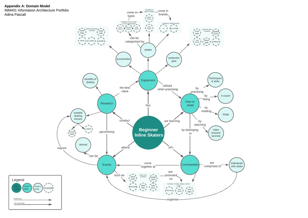
I centralised my key entry as Brown (2007) states that centralised nodes emphasise importance rather than direction. Following his principles, I established a clear hierarchy, by using varied node sizes, colours and labelled backgrounds to represent different entry levels.
From my domain interviews, I categorised my data into 5 main groups that formed my level 1 entries, then established relationships classified as level 2 entries and added examples where appropriate. I used heavier weighted lines to emphasise relationships between the key entry and level 1 entries.
Step 3:
Site Map
I used Optimal Sort to run an open card sort study on 10 participants who have skated for a year. I used information from my domain model to create my card labels. Analysis of my dendrogram revealed that there were 4 main categories as opposed to the 5 in the domain model.
I used Treejack to test the labelling and organisation of the site map, where I asked 5 participants to complete three tasks. They were all able to complete them successfully.
My sitemap structure places emphasis on navigation and search systems. In terms of navigation, my sitemap features the global navigation that is justified by my dendrogram, local navigation that is justified by my domain model and card sort, utility and footer navigation that is justified from my content reviews and faceted navigation that was justified from my domain model example entries. In terms of search, my sitemap features a global search bar, as well as search result databases that the user would be shown pages of based on their filtered search results. This last point was informed by reflecting on my feedback from the IA showcase, where I discovered that the faceted search filter should come before the databases.
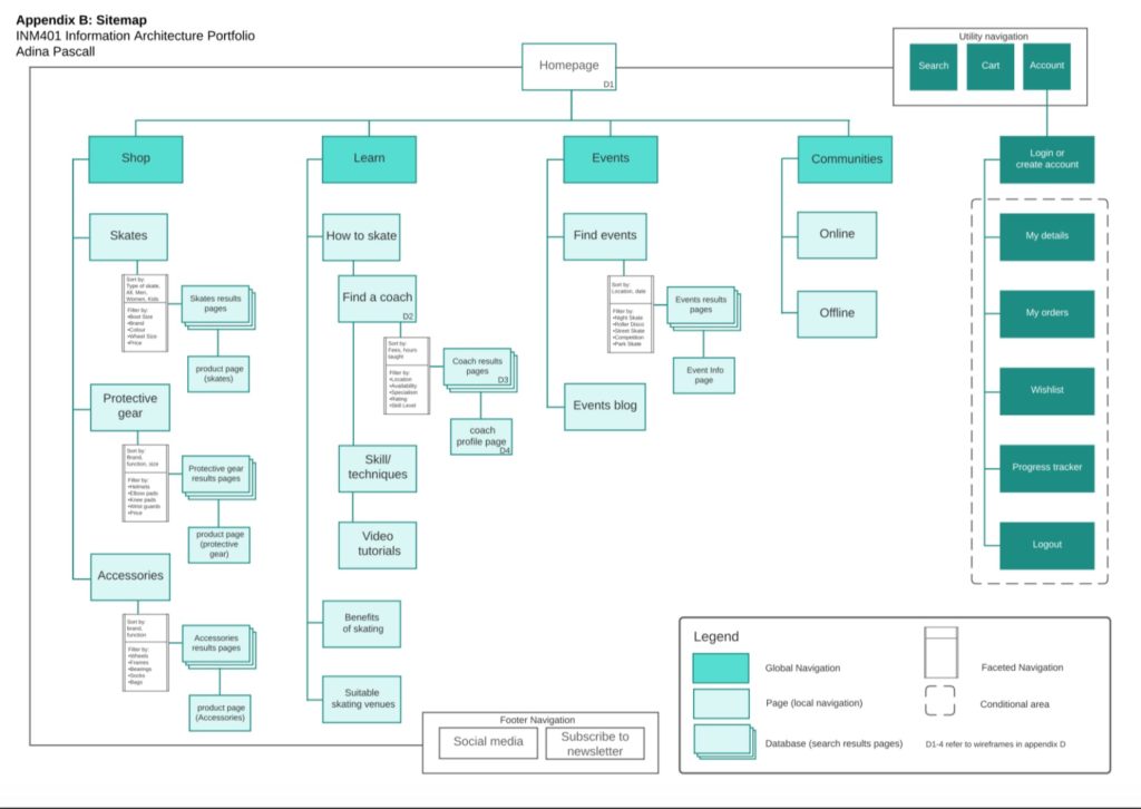
I made the site map clear to read and understand by being consistent in using the conventions explained in Garret’s (2002) visual vocabulary for IA guide. I outlined these in the legend.
To further aid in enhancing the clarity of the site map, I ensured that the diagram filled the entire page and had plenty of white space. I also used different colours to distinguish between the global navigation, the local navigation and the utility navigation.
Step 4:
User Journey
I then applied the findings from the tree test to map out the user journey. One of the scenarios in the tree test was “You have recently started skating, but you are struggling to skate independently. Find a skating coach”.
As users were able to complete this task successfully, I decided to adapt this to form the user journey goal. Feedback from presenting my models in the IA showcase was very useful for improving my user journey.
Initially, my user goal was to add elbow pads to the cart, however, I felt that this was too eCommerce focused rather than informational, contradicting a key finding from my domain expert interview.

In alignment with Brown’s (2007) guidance and feedback from the IA showcase, I focused on granularity by mapping out each step the user could take in achieving the goal.
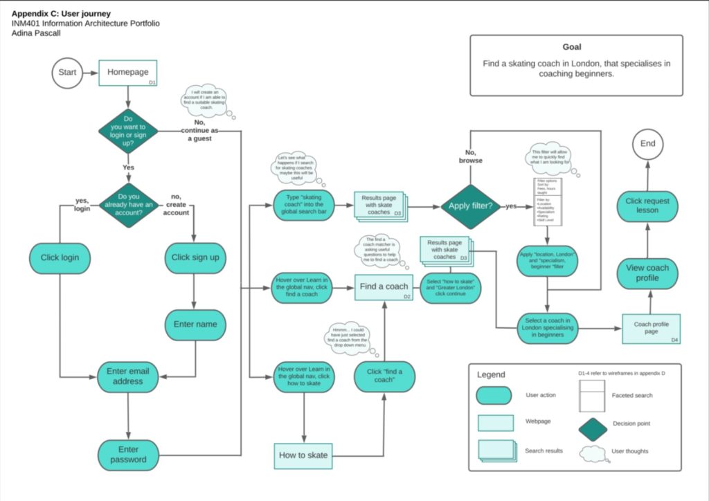
Upon reflecting on my IA showcase feedback, I made the following changes to enhance the clarity of the user journey map: I stated that the user would start on the homepage, made the decision arrow labels clearer and easier to follow, stated the faceted search values that the user would select, added user thoughts and added the search terms that the user would enter to show how the user would navigate through the site. These edits made the user flow easier to understand. To keep the model consistent with the site map, I used the page, faceted search and database convention where relevant in addition to the decision and action conventions.
I also used different colours to distinguish between decision diamonds, actions, user thoughts and page. I designed the user journey to be read from left to right, stated the goal clearly at the top of the page and included a legend at the bottom of the page to make the model easier to read and interpret.
Step 5:
Wireframes
How the site map and user journey informed the wireframe designs
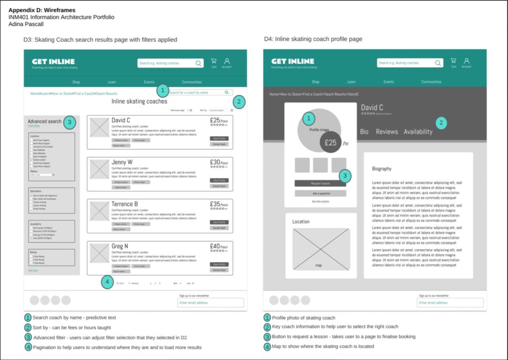
The sitemap shows how the information environment will be organised, labelled and how users can search and navigate through the site. Informed by the results of the tree tests I picked a user goal and journey as depicted in Appendix C. My wireframes illustrate important screens from this journey of users going from the homepage to finding a coach.
On the site map, I have indicated which pages have been illustrated as a wireframe. There are many elements of the sitemap that informed the design of the wireframes. For example, the global navigation bar shown in Appendix D, (D1-4), uses the same labels as depicted in the sitemap. The utility navigation and footer navigation on the sitemap is also reflected on all wireframes. In terms of search systems, the faceted search functionality has been illustrated on wireframe D3 and corresponds to the answers that the user selects in D2.

Therefore, D3 and 4 provides the user with key information to determine which coach to select. Furthermore, the filters on D3 can be further edited to help users to refine their results more. Russell-Rose and Tate (2013) explain that expertise plays a big role in how users seek information. As the information environment will be used by novice skaters, I have designed D2 to walk users through applying filters to help when to find the right coach. The answers that users select in D2 correspond to the filters that are selected in D3 and the subsequent results that they are shown.
How IA principles informed the design of the wireframes:
According to Flemming (1998), a navigation system should answer general navigation questions to help users to understand where they are, where they came from, what they can do and where they can go. In order to fulfil this, D2, 3 and 4 feature breadcrumbs to help the user to understand where they are and where they came from. Also, D3 features pagination to help them to navigate through results. Furthermore, Flemming (1998) states that navigation systems should help users to find relevant information, to help them to achieve their goal.
Step 6:
Evaluation
The final step in the process involved evaluating the wireframes using a critical self-assessment from an IA perspective and against established IA design principles.
I included users in my evaluation, and focused on determining how well organised, labelled and easy to navigate potential users considered the information environment to be.
My task was to capture IA requirements before designing the IA of an information environment that focuses on how information is organised, labelled and navigated. The domain model, sitemap, and user flow all informed the design of the wireframes.
Prior to conducting user testing, evaluated my wireframes and made the following IA improvements to my wireframes: In D2, I included a local search box where users can search for a coach by name rather than having to apply filters each time. This would help returning visitors to find the information they need quicker. I also added in a progress bar that helps users to understand where they are in the process and to help them to anticipate how long it will take them to complete the action.
According to Cardello (2019), high findability and discoverability results from an IA that is well defined and that has a well-designed navigation system. Therefore, I asked 3 participants to remotely do a user test to evaluate the IA. This involved creating a clickable prototype of the wireframes and asking the participants to think out loud, whilst showing me how they would complete the task stated in the user journey.
- Whilst the participants were able to identify that the ‘find a coach’ page was under the label ‘learn’ some users initially hesitated. This implies that there is high discoverability but findability could be improved. I could achieve this by changing the label ‘learn’ in the global navigation to ‘how to skate’ and make the pages in the drop-down menu to find a coach, “learn skills and techniques” and “video tutorials” more obvious, rather than ‘buried’ in the sub-menu. I could include a blog, where users could learn the benefits of skating and suitable skating venues. I would test this with a closed card sort and further user testing. This could facilitate users going from D1 to D2 quicker.
- Most of the participants found the skating coach matcher (D2) useful, however, one participant voiced that it was like filling out a form which can be frustrating. This suggests that some users may prefer to use traditional faceted search to refine their results. This could be resolved by making it clearer that if they don’t select an answer for each question in D2, they can skip and navigate to D3 where they will be able to use the advanced filter option to refine their search.
Based on the evaluation. I would be keen to examine the site navigation in more detail to see if allowing users to access a page from the local navigation, that displayed all coaches, with the ability to refine searches would aid navigation and searchability, rather than users accessing results via D3. I would be able to use user testing to determine if this improves the site’s IA.